

3 graphic design trends to get inspiration from
Visual content is everywhere and your organization needs to stand out from the crowd. For that, you need of course to respect graphic principles, choose the right style and the right color palette (which match your identity as a brand and speak to your audience), but also stay up to date with the latest design trends. We share with you 3 versatile trends that will make your next visual or communication material pop...
Images are key elements in your communication efforts and are a powerful tool to connect faster and better with your audience online and offline. Well-thought and creative designs will also help you establish a significant and differentiated presence on the market.
Whether you plan to refresh your overall company’s image or produce specific communication medium, we selected 3 inspiring graphic design trends especially for you:
Negative space or “white space” consists in leaving a space or special shape empty in a design. Usually, graphic designers use those spaces to build an optical illusion which blurs the borders between different objects or creates bonds between them.
In short, Negative space creates that “vital air” for a more vivid and dynamic visual, which stays elegant and modern as well. This technique is most commonly seen on logos, posters, illustrations, but is also largely used for websites and mobile apps.
One thing to remember is that the “negative space” does not have to be necessarily white; in fact, it can be of any color, texture or even a background pattern or image.
One of the most famous designers known for Negative space works is Noma Bar, who created illustrations for many magazines and international press such as The Times, Courrier International, The Guardian, Review or Internazionale:

Interesting facts:
- Visual content is 40 times[1] more about to be shared on social media than other kinds of content;
- According to a research conducted by 3M, visuals are processed 60,000 times[2] faster by the human brain than text;
- 65% of people are visual learners [2];
- People retain 80% of what they see, 20% of what they read and 10% [2]of what they hear.
Images are key elements in your communication efforts and are a powerful tool to connect faster and better with your audience online and offline. Well-thought and creative designs will also help you establish a significant and differentiated presence on the market.
Whether you plan to refresh your overall company’s image or produce specific communication medium, we selected 3 inspiring graphic design trends especially for you:
- Negative Space
- Minimalism
- Double exposure
Negative Space
Negative space or “white space” consists in leaving a space or special shape empty in a design. Usually, graphic designers use those spaces to build an optical illusion which blurs the borders between different objects or creates bonds between them.
_Mads Soegaard“White space is like a canvas: it’s the background that holds the elements together in a design, enabling them to stand out”
In short, Negative space creates that “vital air” for a more vivid and dynamic visual, which stays elegant and modern as well. This technique is most commonly seen on logos, posters, illustrations, but is also largely used for websites and mobile apps.
One thing to remember is that the “negative space” does not have to be necessarily white; in fact, it can be of any color, texture or even a background pattern or image.
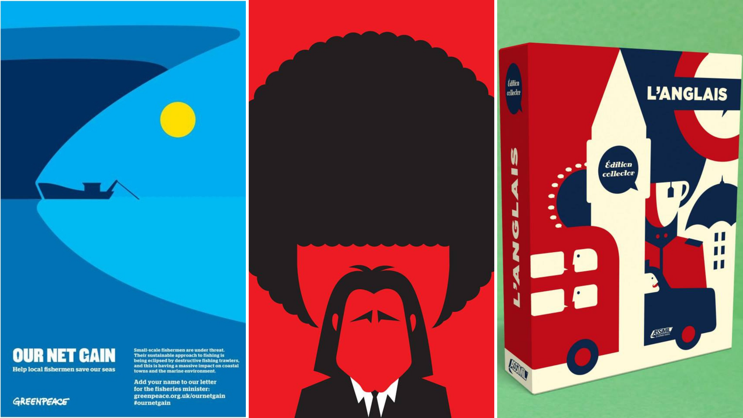
One of the most famous designers known for Negative space works is Noma Bar, who created illustrations for many magazines and international press such as The Times, Courrier International, The Guardian, Review or Internazionale:
CLICK TO ENLARGE
Source: https://www.facebook.com/pg/NomaBar/photos/?tab=album&album_id=10151088714582109&ref=page_internal
Source: https://www.facebook.com/pg/NomaBar/photos/?tab=album&album_id=10151088714582109&ref=page_internal
Another artist who is worth mentioning is Tang Yau Hoong, an illustrator and graphic designer from Kuala Lumpur, Malaysia. His designs are fun, conceptual and surreal in the most simple and unique way:

CLICK TO ENLARGE
Source: http://kreatank.com/portfolio/

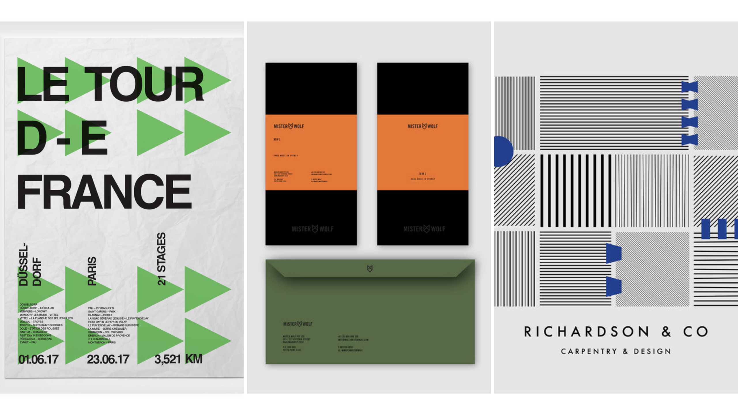
And last but not least, Daniel Bodea– aka Kreatank – specializing in animal-based designs and who is a master of negative space applied to logos:
CLICK TO ENLARGE
Source: http://kreatank.com/portfolio/
Minimalism
Minimalism art movement born during the late 1960s is nowadays back. This movement follows the assumption “less is more” and aims to create a powerful design only with the most essential components. The effect is that the visual catches the eye in no time, and the message delivered is more clear and direct.
“There is a poetic nature to minimalism that is about striking a balance between full and empty.”
_Jennie C. Jones
This art movement did not only influenced visual arts, but also architecture, fashion, interior design, and even music. Today, minimalist design makes a coming back in web design and branding (from visit cards to complex product packaging). This aesthetic is among others a perfect choice for luxury, cosmetic and natural brands.
Some examples of minimalist website designs:

CLICK TO ENLARGE
Source: https://builtbybuffalo.com/
 CLICK TO ENLARGE
Source:http://evoulve.com/
Source: https://builtbybuffalo.com/

Source:http://evoulve.com/
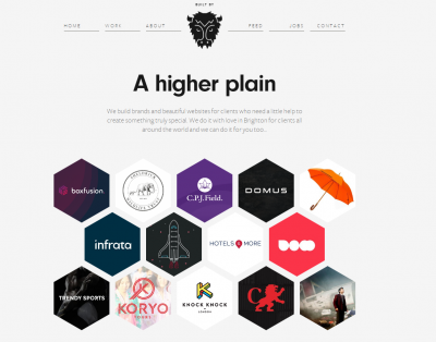
One great artist known for its minimalist designs is Rick Barclay. This art director and designer based in Sydney specializes in branding and prints, characterized by clear lines and shapes:
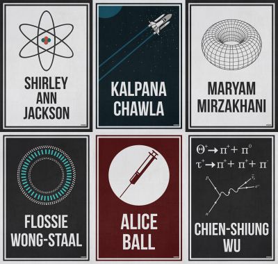
Hydrogene Portfolio is another illustrator and graphic design who masters minimal designs for Sciences, Technology, Engineering, and Mathematics related materials:
CLICK TO ENLARGE
A younger artist, Matt Wisniewski has been experimenting with various artistic media, in order to create those hypnotic and dreamy mash-up collages:

[1] https://www.alioze.com/chiffres-web
[2] Ethos3
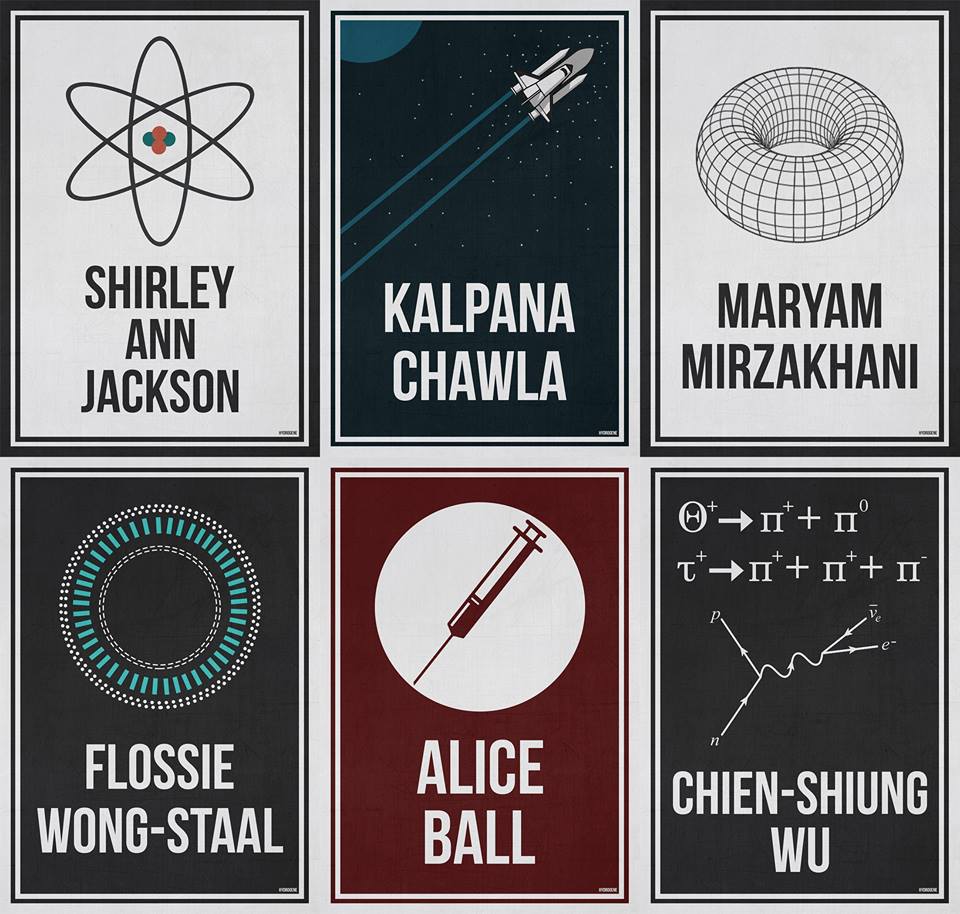
CLICK TO ENLARGE
"Women In Science" collection. Source: https://www.facebook.com/HydrogenePortfolio/
"Women In Science" collection. Source: https://www.facebook.com/HydrogenePortfolio/
Double Exposure
Double exposure is a technique used in photography and cinematography which consists in superimposing two or more exposures to create a single image. This technique is also used by graphic designers to overlay several pictures over another.
Double exposure is a great choice for posters, web designs, and covers, especially if the goal is to highlight the relation between the object and its environment. The result indeed is highly aesthetic and poetic.
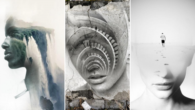
For example, Spanish artist Antonio Mora's double exposure portraits merge human faces with ethereal landscapes and distinct architectural forms:

CLICK TO ENLARGE
Source: Pinterest
A younger artist, Matt Wisniewski has been experimenting with various artistic media, in order to create those hypnotic and dreamy mash-up collages: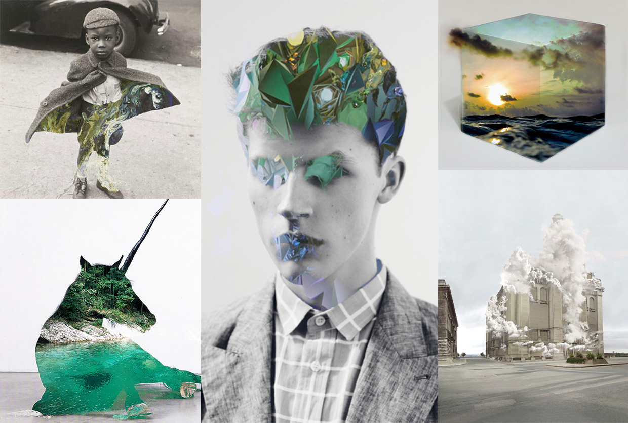
CLICK TO ENLARGE
Source: https://mattw.art/
Source: https://mattw.art/
- Which of these trends do you like the most?
- Are you planning to use one of those techniques for a future creative project?
[1] https://www.alioze.com/chiffres-web
[2] Ethos3